About Josh Mitchell
- Founder of M6L
- Full stack consultancy
- 20 years Drupal experience
- Musician and outdoor enthusiast
- Connect: LinkedIn or Drupal Slack

Why Image Manipulation Matters
- Drupal's image manipulation options are hard to beat
- Image styles, responsive images, and toolkits (GD & ImageMagick)
- Create consistent and performant images
- Empower editors without design skills
Choosing Performant Image Formats
The evolution of web image formats
The Early Days (1993+)
- GIF: Flat images, few colors, logos, transparency & animation
- JPEG: Complex rasterized images, photos
- PNG: Better compression, replaced GIF for graphics
Modern Formats
WebP
Better performance for both graphics and photography
Supports transparency and animation
AVIF
30-50% smaller than WebP at similar quality
Increasing browser support
Best Practice Today
Use WebP or AVIF with a WebP fallback
Otherwise you're wasting bandwidth and energy
Which Image Toolkit?
Drupal provides options for image processing
GD (Included in Core)
- Good for most use cases
- PHP 8.1+ supports WebP and AVIF
- No additional setup required
Configure: Media → Image Toolkit
ImageMagick
- Wider range of image formats
- More options for color profiles
- Advanced effects capabilities
- Available on Acquia, Amazee, Pantheon, Upsun
Check with your host for availability
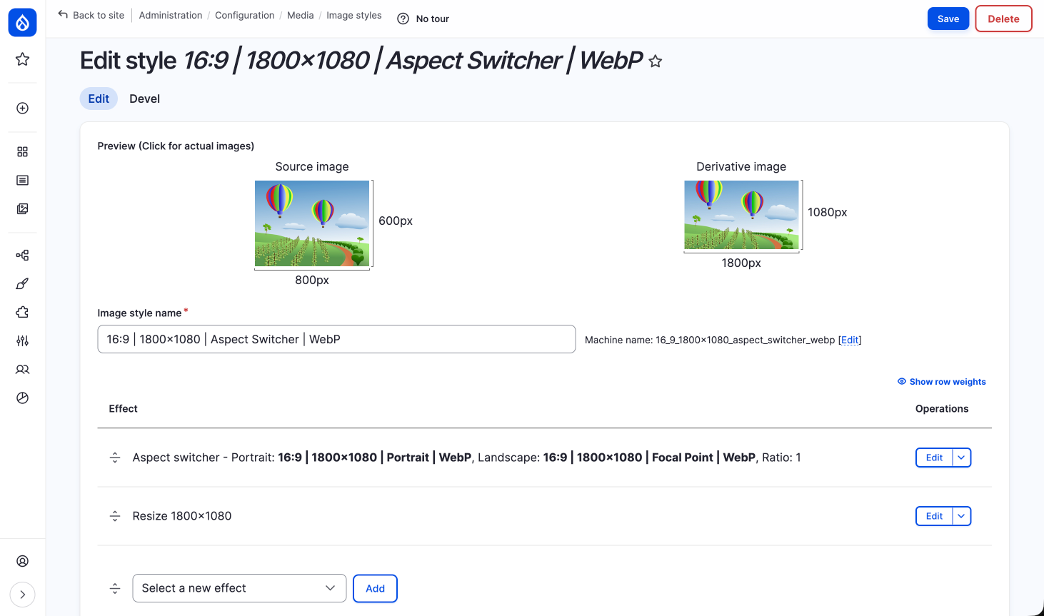
What are Image Styles?
Apply a series of effects to transform images
Typical Image Style
- Focal Point Scale and Crop (330×165)
- Convert to WebP
Order of effects is essential!
Advanced Effects
- Add text to images
- Convert to circles
- Transparent backgrounds
- Grayscale conversion
- Custom color fills
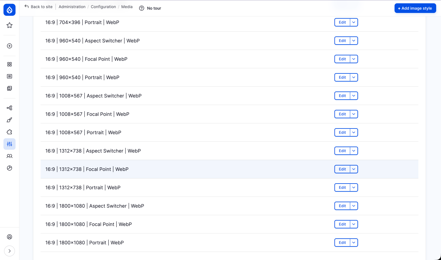
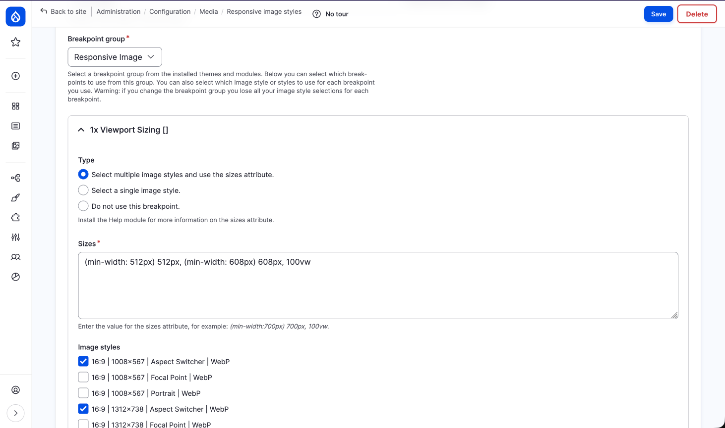
Responsive Image Styles
Different images for different devices
How Breakpoints Work
- Defined in your theme
- Based on viewport sizes
- Account for pixel density
- Browser chooses the best image
Example Scenario
Older computer: 1024px viewport → smaller image
Modern mobile: 375px @ 3x density → larger image
It's not just about width!
Picture vs Srcset
Two approaches to responsive images
Recommended: img + srcset
<img src="image.jpg"
     srcset="image-small.jpg 400w,
             image-medium.jpg 800w,
             image-large.jpg 1200w"
     sizes="(max-width: 600px) 100vw, 50vw">
Browser chooses based on viewport and pixel density
When to Use Picture
When you need different aspect ratios at different viewports
Desktop
Mobile
⚠️ Caution with user-uploaded images
Options to Crop Images
Helping editors meet design requirements
Core Cropping (Not Ideal)
- Scale and Crop: Only works if subject is centered
- Crop and Scale: Crops before scaling (rarely works well)
We need better solutions!
Contrib Modules
Both require Crop API
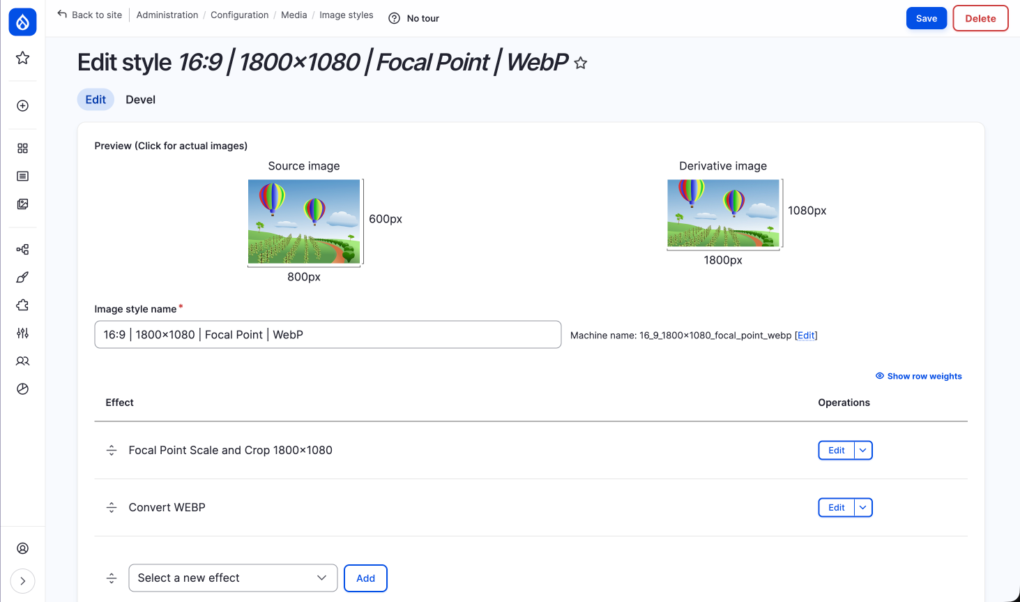
The Focal Point Challenge
Portrait
Photo
Featured
Region
Even perfect focal point tagging can cut off heads or chins!
The Game Changer
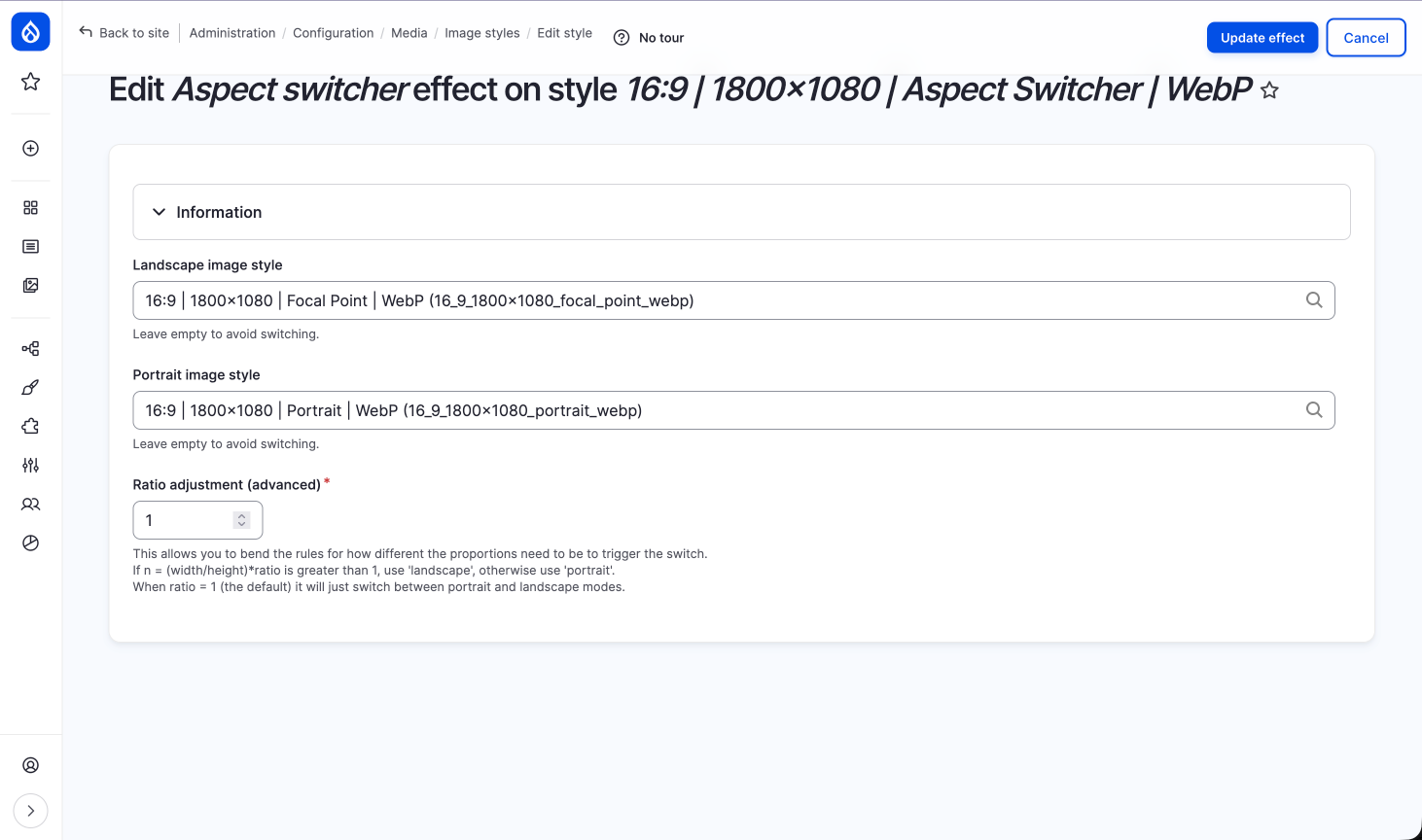
Aspect Switcher Effect
From the Image Effects module
How Aspect Switching Works
Use different image styles based on aspect ratio
Landscape (>1:1)
Use Focal Point cropping
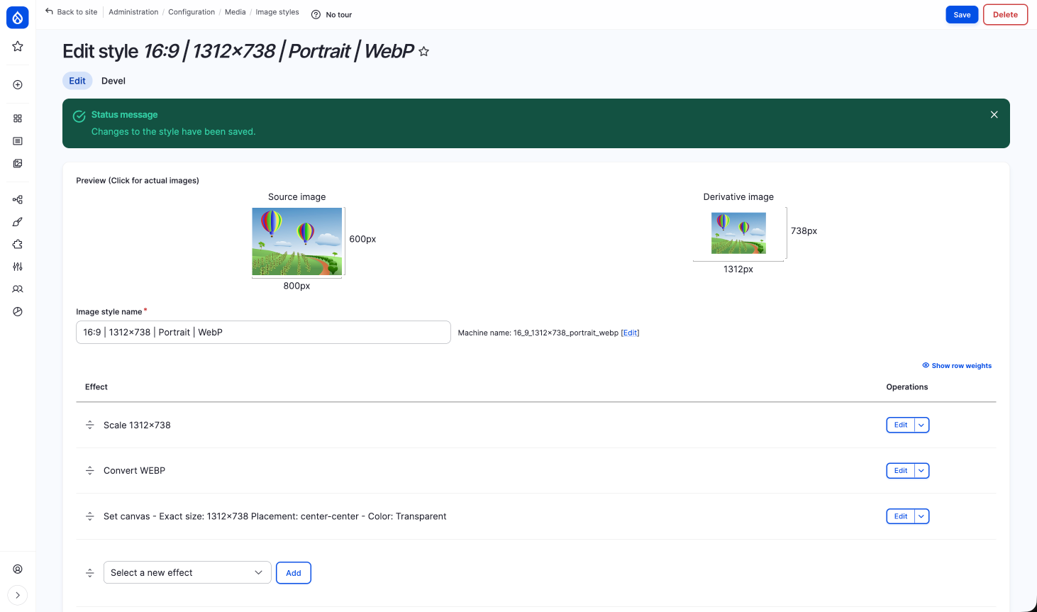
Portrait (≤1:1)
Place on canvas with background
Example Configuration
- Landscape images: Focal Point crop to 16:9
- Square/Portrait images: Place on 16:9 canvas
- Add background color or transparency
- Let theme control background color
No more cut-off heads!
Your Portrait Image Style is Unique
- Scale the image to your desired aspect ratio
- Convert the image to WebP
- Set the image on a 16:9 canvas with a color or transparent background
- The order is important!
Benefits
- Specific design direction maintained
- Editors can upload any orientation
- Consistent aspect ratios in featured regions
- Professional results without design skills
Image Effects Module
More than just aspect switching
- Watermarks
- Borders and frames
- Color adjustments
- Text overlays
- Masks and shapes
- And much more...
Live Demo
Let's see how this works in practice
Best Practices Summary
- Use WebP or AVIF with a WebP fallback
- Choose the right toolkit (GD or ImageMagick)
- Order effects correctly in image styles
- Use srcset for most responsive images
- Implement Focal Point for editor control
- Use Aspect Switcher for mixed orientations
Drupal Image Capabilities
Hard to beat on any platform
Empowers editors + maintains design integrity
Need help with image manipulation?
Connect on LinkedIn or Drupal Slack (@joshuami)
Thank You
Questions?
This work is licensed under a Creative Commons Attribution 4.0 International License