Posted on
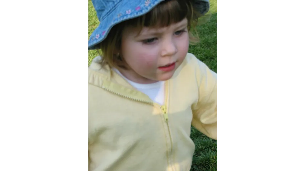
Update: on October 19, 2025, I presented this blog post at the Pacific Northwest Drupal Summit. (Video link below.) As part of that presentation, I changed my featured image for this post. For those that attended last year's PNWDS, you may remember that my daughter (Mishya) and I gave a presentation called Raising a Digital Native. It was great fun. When giving the presentation this year, I found myself without a portrait photo. (I thought I had one, but the ratio must have been off.) Firing up my photo library, the first photos I came across included Mishya at age two playing in the field at the Oregon Zoo. So appropriate for the moment!
Watch the Presentation on YouTube

Drupal's image manipulation options with image styles, responsive image styles, and image toolkits (GD and Imagemagick) are hard to beat. Have you ever wanted a different image style for landscape versus portrait featured images? Want a custom background fill? Need to make all your images grayscale? Drupal can do that and more. Learn what's possible with image effects to create consistent and performant images.
Choosing performant image formats
For many years, the internet was text without images in the form of message boards. It was the World Wide Web, which launched in 1993, that represented the dawn of embedded images.
At the start, GIF and bitmaps were the go to format for images, with JPEG being introduced shortly thereafter.
For many years, the general consensus based on format and browser support suggested that GIF should be used for flat images (and eventually images involving transparency and animation) with few colors and stark lines such as logos and graphics while JPEG could be used for complex rasterized images with many colors and shading. PNG, once widely adopted, took over much of the logo and graphic space with better compression and transparency support.
All of that shifted pretty radically in the past 10 years were WebP support and better browser upgrade paths pushed that format into a premier position for both graphics and complex photography. It just performed better than all the rest and supported both transparency and animation.
In the last few years, AVIF support has increased with up to 30-50% smaller images than WebP at similar quality.
If your site is not using WebP with an AVIF fallback at this point, it is wasting a ton of bandwidth and energy.
Which image toolkit should I use?
For years, the responsibility of image performance would fall to designers that would export images for an acceptable size and compression for their use case. This was great for design direction, but it left the less capable editor out of the mix.
Drupal has excelled at provided options for the common editor to upload a high-quality, low compression image (often straight from the camera) to a website and subsequently resizing that image with an image toolkit. The two most common image toolkits for Drupal are GD and Imagemagick (actual spelling). The toolkits can be combined with image styles to resize images on upload as a PHP process.
GD is included in Drupal core. It's good for most use cases. If on a site with at least PHP 8.1, it can support both WebP and AVIF formats.
Imagemagick has long been a go to when you need to support a wider range of image formats. It has quite a few more options for color profiles and advanced effects as well. The Imagemagick module allows Drupal to be aware of all of these capabilities when it is installed on your server. Check with your host to see if Imagemagick is available. Common hosts like Acquia, Amazee, Pantheon, and Upsun have it preinstalled or easily added as an option.
In Drupal, you set the toolkit in the admin menu at media > image toolkit.
What are image styles?
Drupal's concept of image styles allows you to create style and apply a series of effects. For example, you can convert an image to a new format, crop, resize, and scale. The order of the effects is essential to getting the desired result.
A typical image style, might do the following:
- Focal Point Scale and Crop 330×165 (This is a single effect that sets the overall image size.)
- Convert WebP (I usually do conversions after any scaling or cropping.)
Advanced effects might include adding text to an image or converting it to a circle with a transparent background.

What are responsive image styles?
Drupal's concept of responsive images allows you to provide design direction based on multiple breakpoints defined in your theme.
Breakpoints are measurements of common viewport sizes converted that browsers interpret to choose which image is loaded from a list of possible images.
For every responsive image, you define the rules for when the breakpoint will deliver a different image style.
The result is that your site will deliver the image that is at the size appropriate to the device loading the webpage. This may be a little more complicated that you might first think. The ideal size is going to be a combination of the devices rendered viewport size (pixel width), but it also takes into account pixel density. So an older computer with a 1024 pixel width viewport might need a smaller overall image than a mobile device with 3 times or 4 times pixel density.
When should I use picture versus srcset?
It's because of pixel density selection that I usually recommend sites use the img element with the srcset and sizes attributes rather than the picture element. These attributes allow you to suggest your intent and let the browser choose the best image. The picture element explicitly sets the image size based on the viewport width.
The one time the picture approach is extremely helpful is when you deliver a different aspect ration when the viewport is a particular size. An example would be a site that loads a 16:9 ratio image (widescreen, landscape) for larger displays and a 1:1 ratio image (square) for smaller displays. I would caution against this for editor or user uploaded images. They simply won't have the skill an ability to crop the image correctly most of the time.
Options to crop images in Drupal
So if you have editors or users uploading images, how do you get the sized and cropped in a way that meets your design intentions.
For images uploaded and embedded within content, such as with the media library embed in CKEditor, you probably don't want to provide a default cropping option. Whatever the editor has uploaded is likely the height and width they intend—or at least it will work for the situation.
For images uploaded in an area strictly intended for a specific aspect ratio, such as 16:9 or 2:1 or 1:1, the 3:4 or 4:3 photo taken with a mobile phone (or any camera) may not be the size you'd like. The solution is cropping the image to match the aspect ratio as part of the upload process.
Image styles in Drupal core support both scale and crop as well as crop and scale—but you probably don't want either of these options.
Scale and crop may work if you are lucky enough that the image's subject is positioned within the exact center of the photograph. I find this rare in practice. If you are a trained photographer, you learn to frame your subject based on the window you are viewing. If your aspect ratio is 4:3 (landscape), then you fill that window, likewise if your window is 3:4 (portrait). That doesn't work well if your image style does a scale and crop to 16:9.
Crop and scale rarely works. It assumes you can crop an image to a size before you scale it. If you have a portrait of a face, you might et just a nose or mouth... and nothing else.
There are two contrib modules to help editors convey their intention for what they crop should be.
If you install the Crop API, there are a couple of modules that can help with this.
I'll start with the one that doesn't usually work the way I want it to work...
Image Widget Crop lets folks crop images to the dimensions they want to see in the final crop. It does not enforce a specific ratio. So if you let an editor add some crop lines around the subject, you then have to use the scale in crop in core to capture that intention. It results in some weird edge cases that I just don't like.
Focal Point allows for cropping based on a designated "center point" of the image. You drag some crosshairs over the point you want to make sure you don't lose and let the aspect ratio determine the rest. This works amazingly well for any landscape image that is being cropped to a more narrowly defined landscape image. Combined with a preview, you can help editors understand what they will get from the focal point they chose.

It works great... up to the point that someone uploads a portrait image, sometimes called a mug shot.
When the image is portrait, you may not want to crop. In fact, you may need to convert the image and put it onto a canvas to set an image that looks like it is floating on your landscape aspect image.
This is possible by scaling your image first to give it an expected height, then converting the image to allow it to be set on a canvas (centered or shifted left or right) with a transparent background. The transparent background allows you to set the background for the image using CSS in your theme's styles.

However, to have this image style work with only portrait images, you need a little help from the image effects module.
Providing design direction with aspect switching
Cropping a portrait image, say a person looking at the camera from the waist up with a vertical orientation, is a challenge when that image will be used in a fixed ratio featured region. Even if you perfectly tag the focal point of a face in a 3:4 ratio portrait image, then you might end up cutting off the top of a head or the bottom of a chin.
So if you want to allow your editors to upload a portrait image when creating a landscape featured image, what do you do?
Enter Image Effects and the aspect switcher effect. The module adds a ton of effects for image styles, but the aspect switcher, in particular, lets you define the ratio at which you want to use a different cropping technique. Take that... every other platform I've ever used for content management.


Aspect switching allows you to choose two image styles to use depending on the defined aspect ratio. So if you want to use Focal Point with any landscape image (greater than 1:1) and place the image within a set 16:9 canvas for any image that is square or more portrait (less than or equal to 1:1) then you can.
Add a background color, or better yet a transparency so you can set the background color depending on the use, and you are set.

Aspect switching was a game changer on a recent project. It allowed for much more specific design direction in our theme.
Finding that you need a little help in your quest to help editors upload images that meet your design needs? Connect with me on LinkedIn or reach out to me on Drupal Slack (@joshuami).